Optimising property investment assessment
Auditing the user experience for better decision-making

Vestega uses data innovation to optimise land and property investment for local authorities. Their Feasibility platform helps to determine if a property has potential for social housing. However, it was not living up to their promise ‘intuitive, user-friendly data at the touch of a button’.
Audit the Feasibility website’s visual design (UI) and usability (UX) to identify improvements or gaps in the experience. An optimal experience makes it easier for users to achieve their goals. Understanding the user and their decision-making process is key.
Experience Strategy
User Personas
UX Audit + Design
Accessibility Audit
Competitor Audit
Case Studies
Project Management

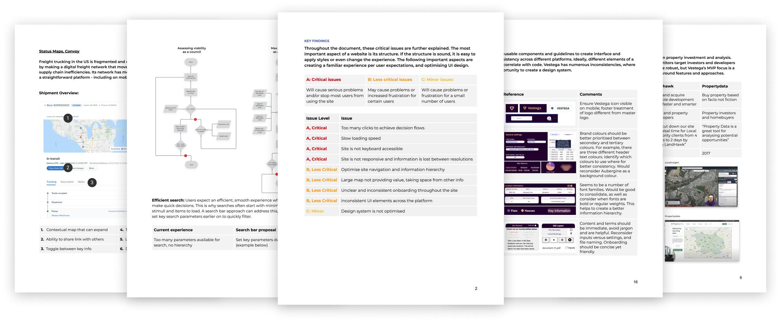
UX Audit: The audit covered key findings, user needs, competitors, usability, accessibility, responsiveness and the design system.

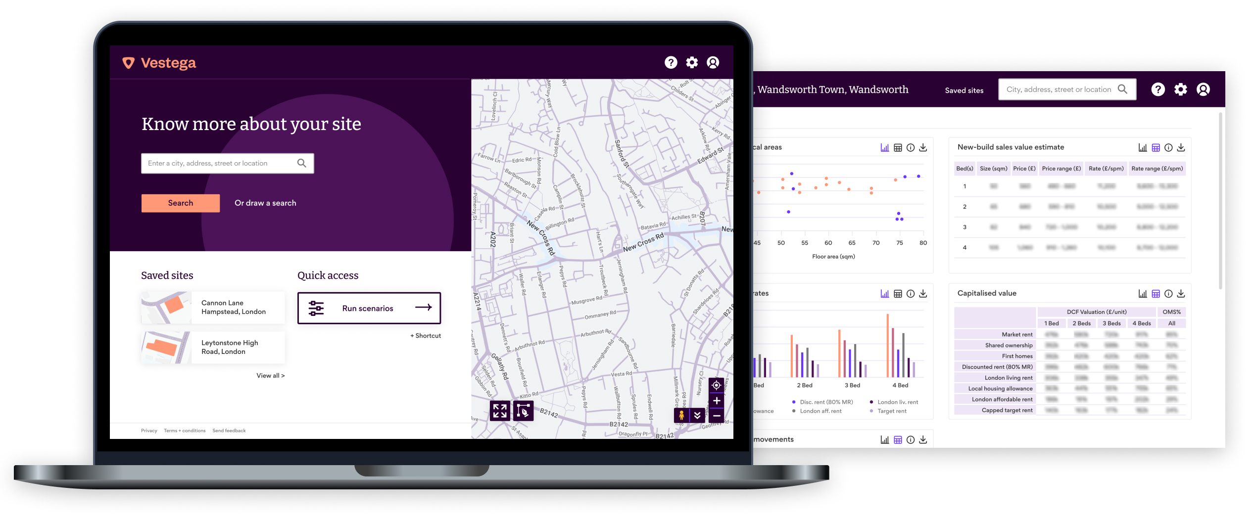
Mock-ups: Applied learnings from the audit to created new screens, improving upon key aspects of the UX and UI.
Outcome
Results
The minimum viable product and target user was clear, which is a huge advantage for a start-up. However, the platform did not enable evaluating potential sites concurrently, making it cumbersome for users. After reviewing the audit’s findings with key stakeholders, it was decided the platform should be rebuilt. The audit also echoed feedback from users.