Empowering businesses with sustainable deliveries
Improving Bringly’s B2B last-mile delivery portal for EU retailers

Bringly specialises in sustainable, last-mile delivery throughout Europe. In order to look more professional and credible, Bringly recently updated their brand identity, however this was not reflected in their B2B portal. There were also parts of the existing portal that were not clear or user-friendly.
It was necessary to focus on key experiences for B2B customers. This was the creation of new deliveries, and tracking of those deliveries. Through a design system audit, competitor research and UX/UI best practices, this and additional screens were improved.
UX/UI Audit
Competitor Research
Project Management
UX/UI Strategy
UX/UI Design
Design System Creation
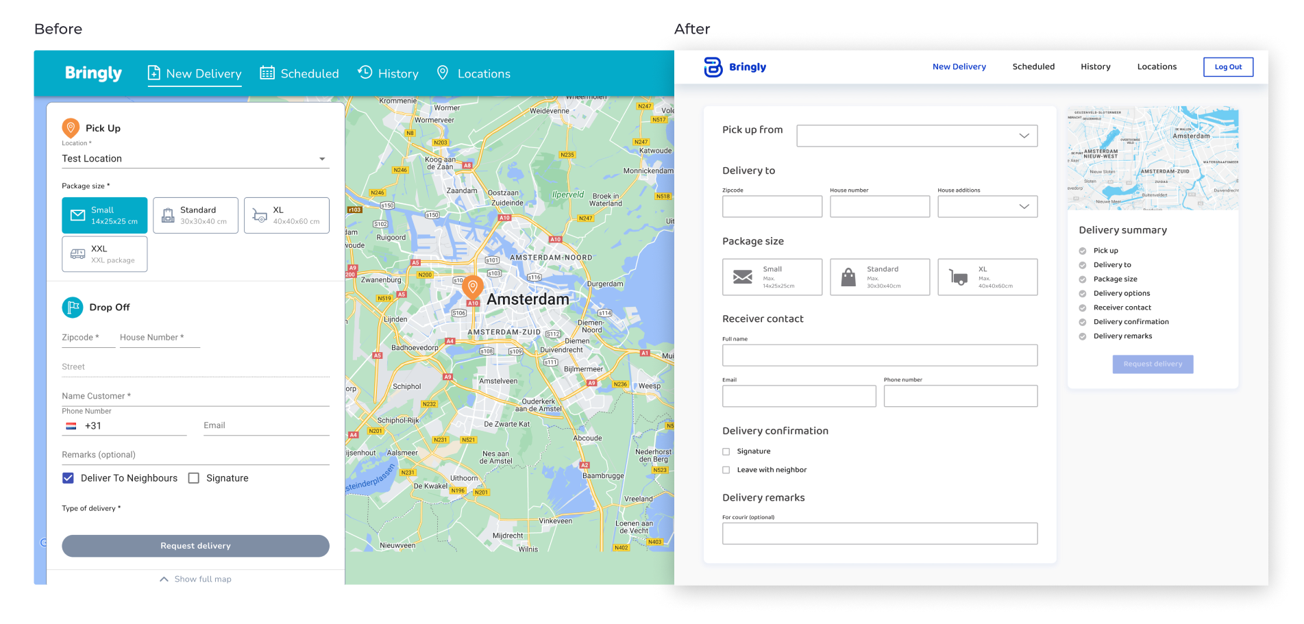
Main improvements: To make it easier to input and check information, more space was provided for creating orders.
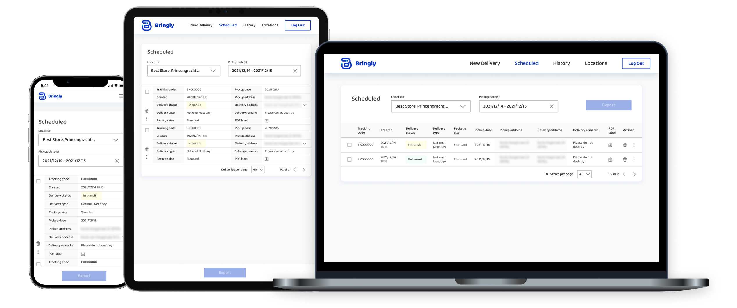
Key screens: After making an order, tracking existing orders was key for users and required a clearer information structure.
Outcome
Results
Pairing audit learnings with UX/UI best practices enabled the start-up to move quicker. This is key when teams are building, iterating and releasing products often. By focusing on the key aspects of the experience - deliveries and tracking - we were able to make a large impact with a focused deliverable.