Personalised yoga therapy for at-home practice
Leading UX/UI and creative direction for the Yogabox app

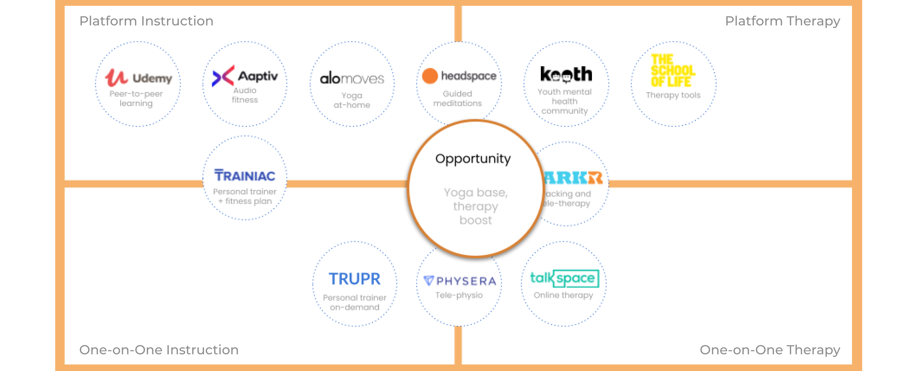
There is no centralised platform empowering both yoga students and independent yoga teachers. When following video classes at-home, yoga students are concerned about misalignment. Yoga teachers are missing personalised connections with students, and view themselves as more than just fitness instructors.
Completed this as a team of one over a series of weeks. Yogabox provides personalised yoga courses, focused on the therapeutic benefits of better alignment. I wanted to create a concept for both students and teachers, as empathy, guidance and connection were main tenants for the platform.
Brand Strategy
Experience Strategy
UX Research
UX Testing
UX Design
UI Design
Analyse
Yoga students and teachers struggle with at-home yoga. For this reason, both were considered for Yogabox. At-home yoga and fitness today is driven by video platforms. With this, students worry about misalignment and injury while practicing at home. On the other side, teachers are missing that personal connection with their students.
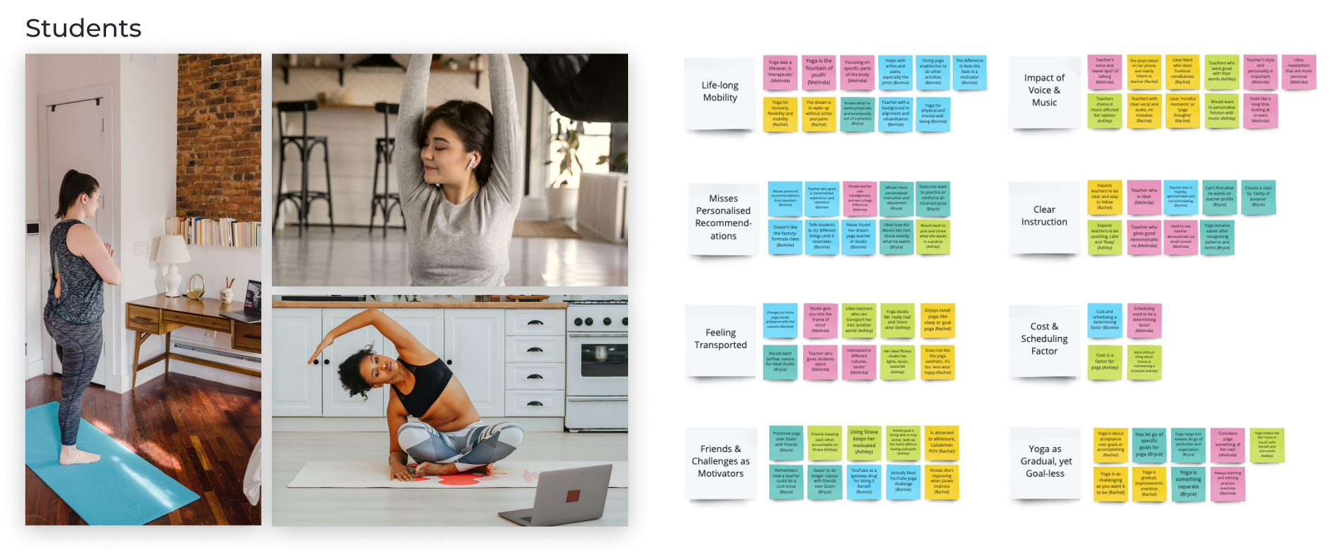
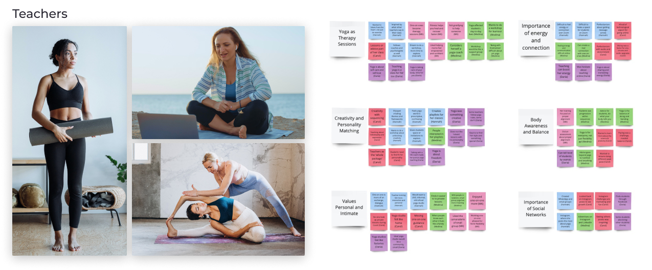
Affinity diagram: Conducted nine interviews with two distinct user groups for a total of 6.5 hours of video. This resulted in 151 insights gathered and organised.
Students’ interests:
Personalised experiences
Feeling transported
Audio cues & music
Better body alignment
Gradual progression
Teachers’ interests:
One-on-one dialogues
Creating ‘spaces’
Creative expression
Understanding anatomy
Enabling exploration
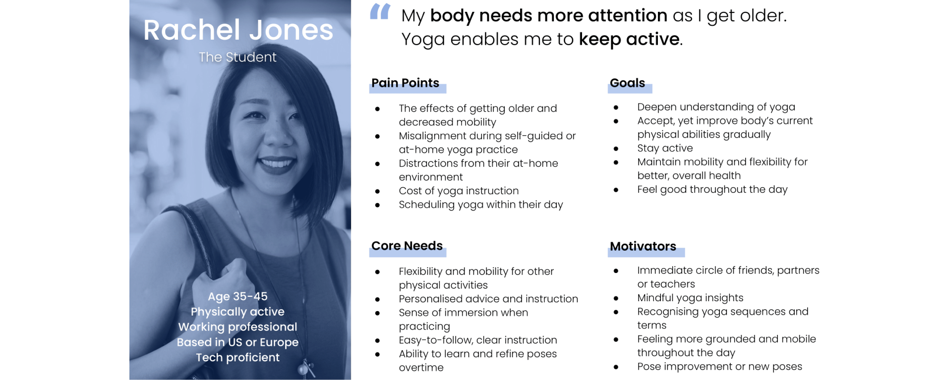
I feel my daily yoga helps make the harder tasks that I do with my body more possible in my old age.
Bonnie, Yoga Student
Many students and teachers started yoga for its physical benefits, to then discover its contribution to mental well-being. They found yoga an effective means of therapy and prevention. This is especially important for the target age group, as they voiced concern around physical mobility while ageing. Yoga was viewed as a lifelong practice focused more on improvement than achievement.
Within the wider competitor landscape there is an opportunity to create something new. This is both from an offering and personality perspective. The wider landscape includes wellness, fitness, physical therapy and tele-therapy. Wellness and fitness platforms are more content-driven, while therapy leans on personalisation.
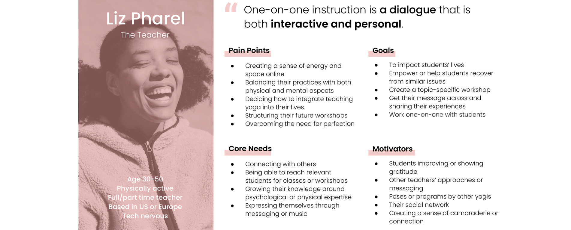
One-on-one is about building something together. It’s more of an exchange. You are having a dialogue.
Hannah, Yoga Teacher
Articulate
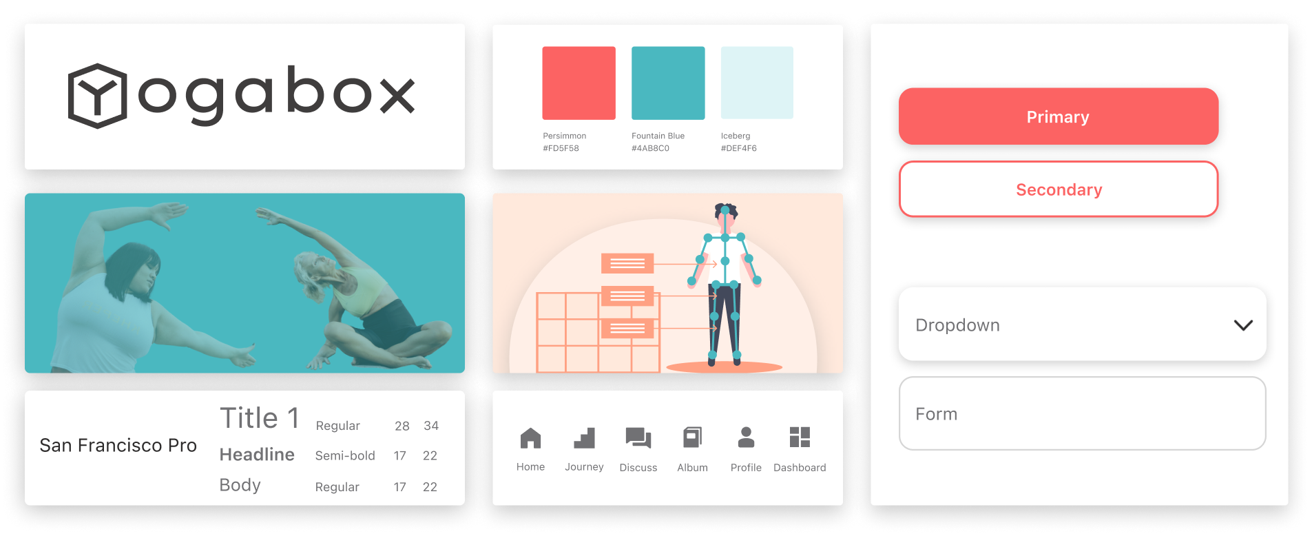
Yogabox’s ‘unyoganess’, or break from the expected expression of yoga, helps to create a space without judgement. Yogabox contributes a new perspective to the wellness and fitness space by bringing a sense of approachability, optimism and interactivity to yoga. The name takes cues from both bento and subscription boxes, reflecting the modularity, convenience and personalisation.
Mission/Vision
Lifelong health starts with physical wellbeing. We provide yoga personalised in real-time, improving alignment and awareness.
Brand Personality
Our brand breaks the yoga mold by combining personality with clarity, freeing users from feeling judged or ‘unyogalike’.
Brand Attributes
Playful: optimism and simplicity
Personal: create a connection
Interactive: delightful dialogue
Supportive: build trust
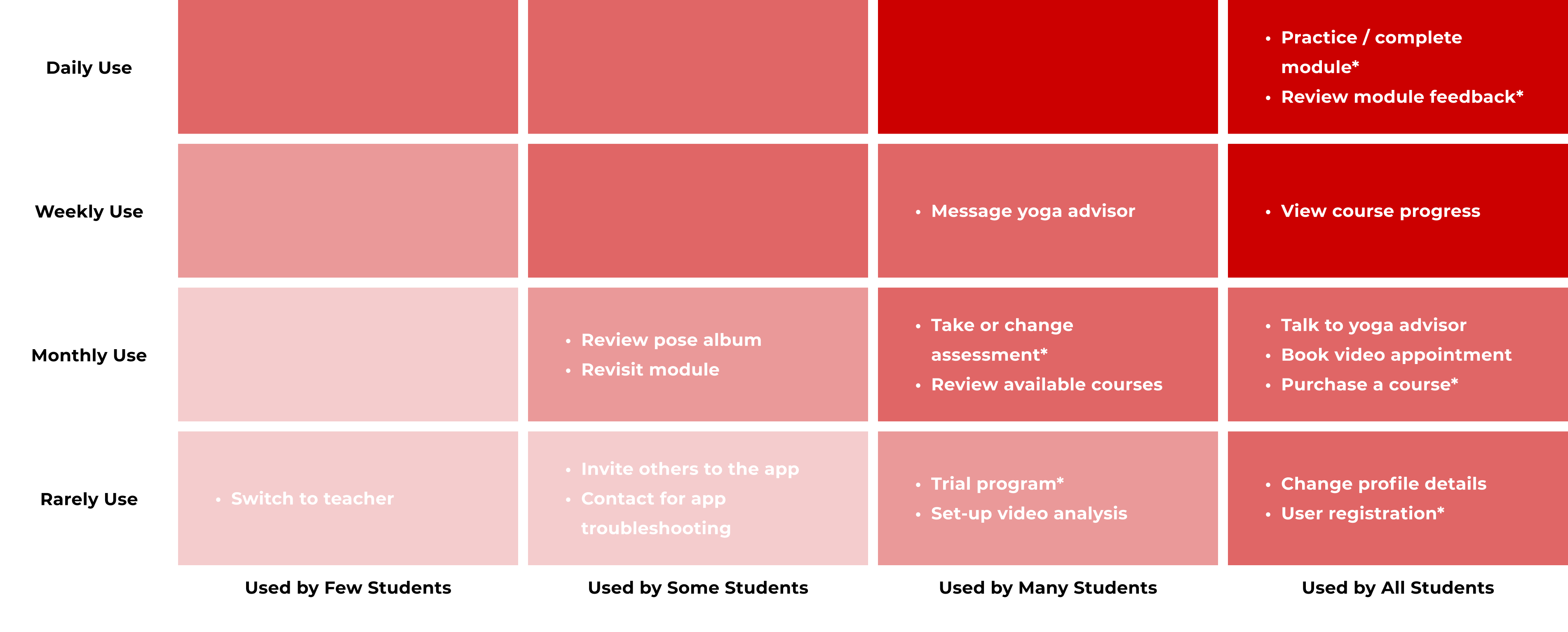
With a new platform and concept, it is important to identify the right user flows to prototype. By mapping the red routes for students, I was able to identify the most used routes or key business drivers. Though some of the starred routes below are out of the frequently used by all zone, they are critical in portraying the platform’s long-term value to new users.
Apply
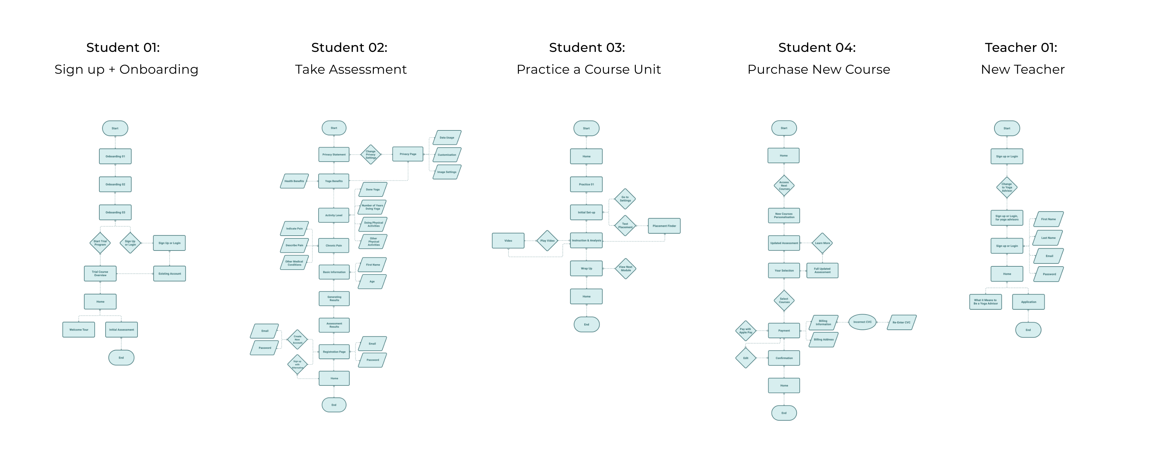
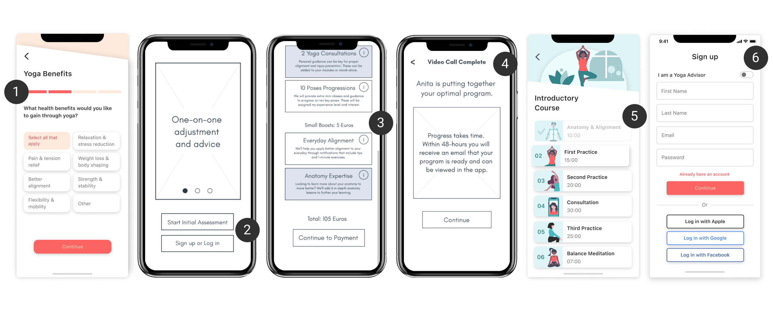
Students were the focus for conceptual app development. Getting started with the app, and continuing to use it while improving yoga alignment was important to understand. Five red routes (four student and one teacher) were explored, in addition to a site map specific to students. The most important aspects were clarity and ensuring the concept was immediate.
Assess
Throughout the interviews, personalisation was a key theme. However, this can be executed and understood in many ways. Through usability testing, it became clear the balance between personalisation and convenience, choice and simplicity, access and earnings. This was done through four rounds of usability tests, each with five users.
1. Product’s Value
Yogabox provided a therapeutic and instructional benefit that at-home yoga programs did not provide.
2. Incentivising Users
Putting the program behind a registration wall disincentivized users.
3. Understandable Modules
Many did not understand they could build their own program from different modules.
4. Video Assessment
A video assessment seemed personalised, yet inconvenient.
5. Revisting Modules
The existing UI made it look like the finished course modules could not be revisited.
6. Switch Users
A toggle was provided to switch to a teacher during sign up. This was overlooked.
The Result
Yogabox brings together the convenience of practicing at home with the benefits of 1:1 instruction. Students are able to trial their personalised yoga classes, while understanding the value of the platform in the long-term. Personalisation comes through curated course modules plus purposeful 1:1 appointments.
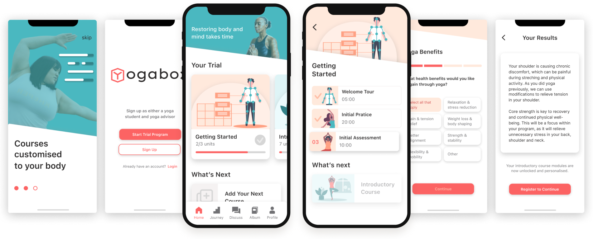
Welcoming Trial Program: Users are able to see the value of the app through an initial assessment, practice and introductory course.
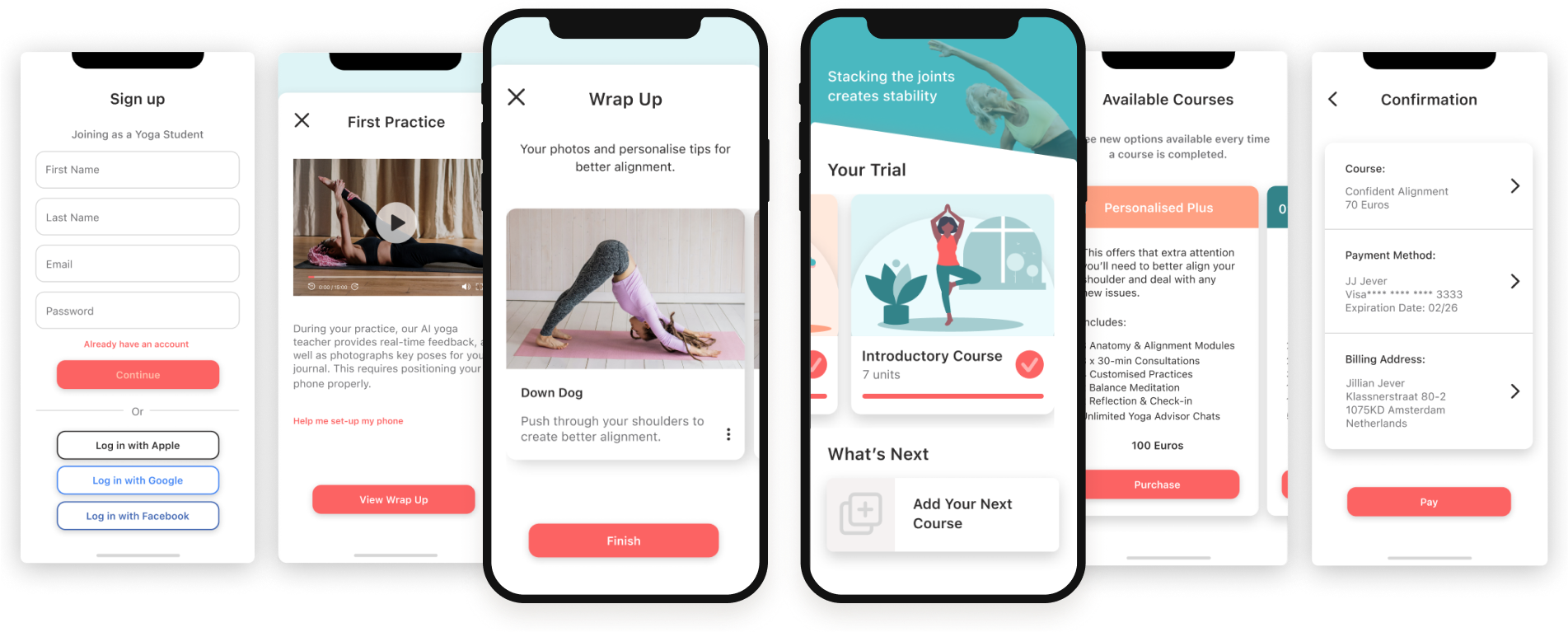
Personalised Experience: Real-time practice feedback and tailored course packages helps users with their specific goals.
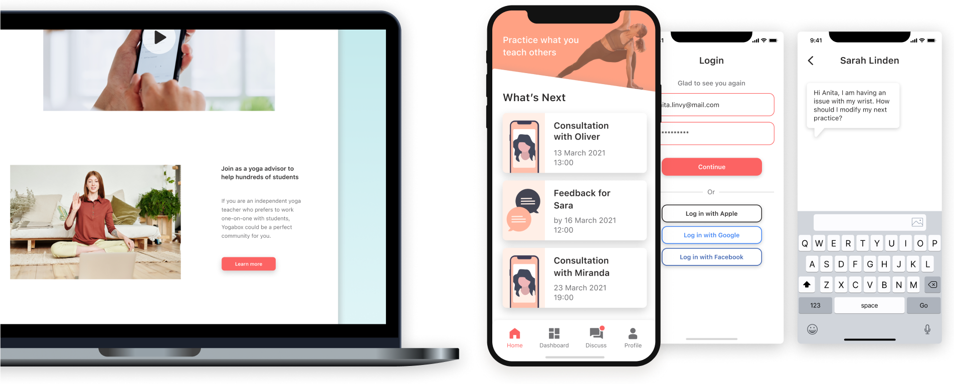
Teacher Dashboard: The platform enables teachers to track tasks and converse with yoga students.
Go ahead, try it out for yourself

The Debrief
and Learnings
It’s clear the app is about both the experience and program structure. By building out one hypothetical course, we could measure its engagement and effectiveness. This pilot phase would help to test the overall concept and whether both users find it worthwhile to use overtime. The lessons learned below can be integrated into next steps for the Yogabox.
Two User Challenge
Two user groups bring added insight and value, but also complexity. I need to focus more on the teachers for the next phase.
Improve Accessibility
There are many aspects to accessibility. This requires further development to enable all users looking for theraputic benefits.
Define Personalisation
This means different things to different users, and it is necessary to define the degree and type of personalisation required.