Find your ideal remote working location
Creating the PostUp app’s MVP through a Google Sprint
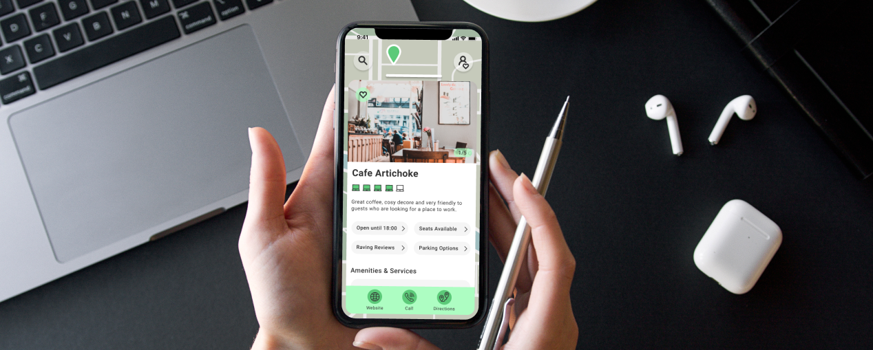
Freelancers and remote workers want to find great coffee shops, free spaces and public spaces to work from. There is a possibility that the chosen location will not have what they need, or the staff are lukewarm to remote workers. Currently, they are frustrated by the time spent looking for places to work.
Established an app MVP by completing a solo Google Sprint over a week. My goal was to try all aspects of the methodology, and identify the most value-add user flow. The use of sketching throughout the process was an effective way to explore how to provide information specific to remote working in out-of-home spaces.
Design Sprint Moderation
Brand Strategy
Experience Strategy
Customer Experience
UX Research
UX Testing
UX Design
UI Design
Analyse
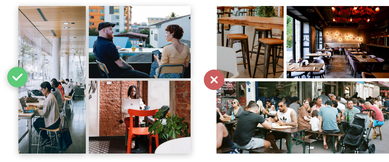
Day 1, Design Sprint. Users are looking for spaces that are quiet, uncrowded, can accommodate phone calls and are appropriate for quick meetings. They desire locations that have quick (ideally free) wifi, outlets and bathrooms. These amenities trump good coffee and food. Finding places in new areas for an hour or two between meetings, or ones that are worker-friendly, is important.
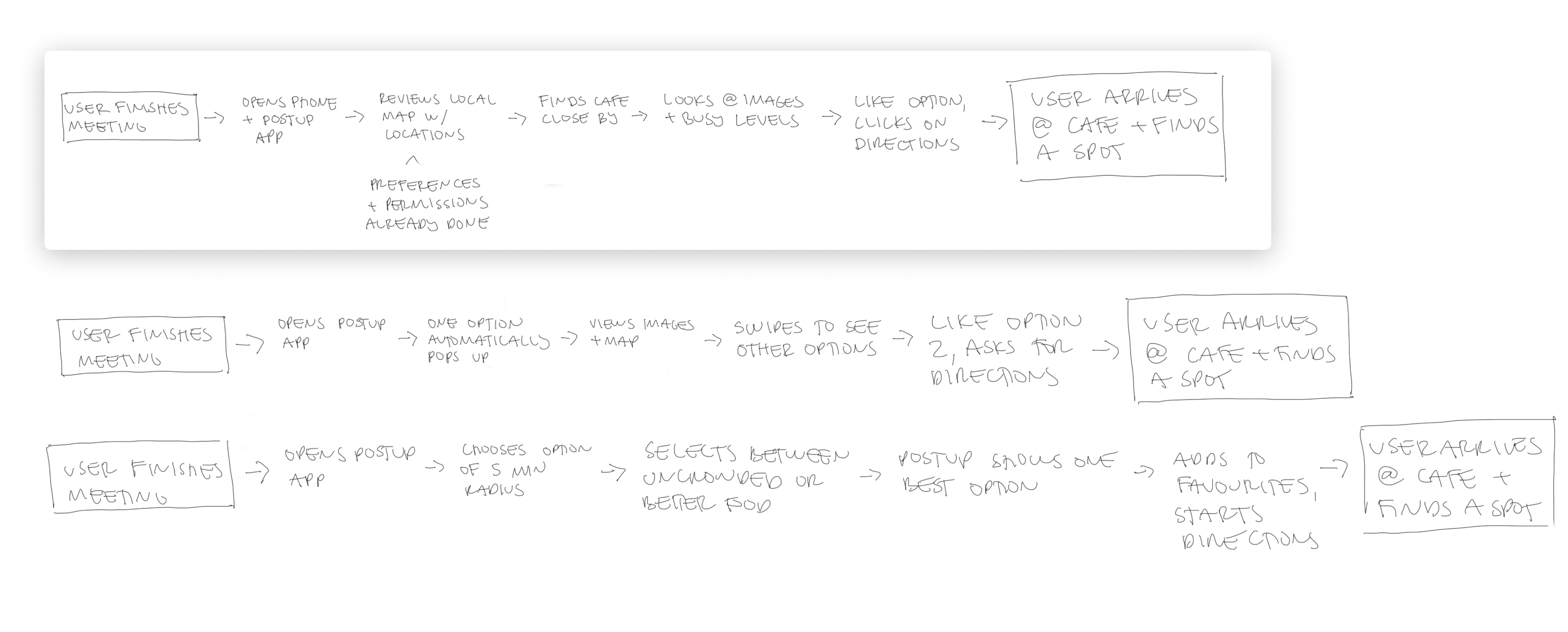
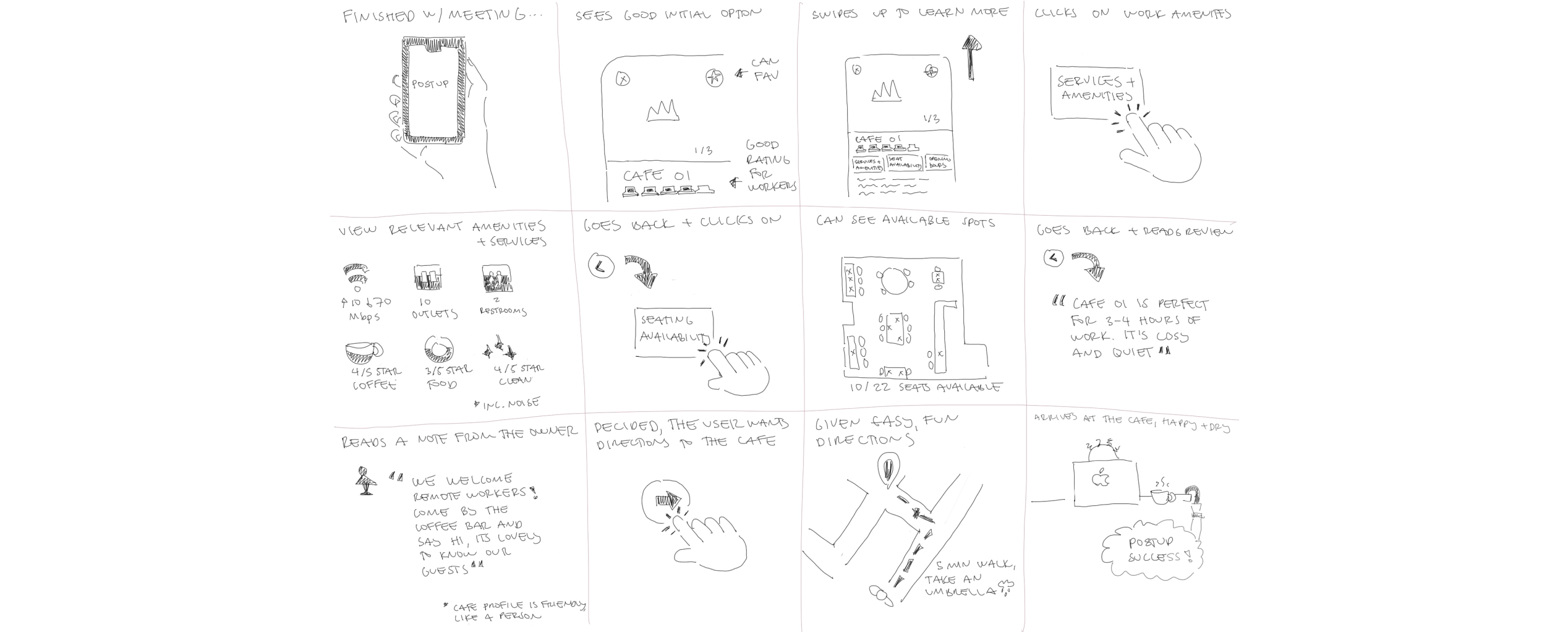
End-to-end experience sketch: In order to understand the app’s functionality within the users’ greater context, an end-to-end experience sketch was created.
If a place has Wifi, outlets and bathrooms - that’s all I need. Bonus points if their coffee and food are actually good!
Claire, Freelancer
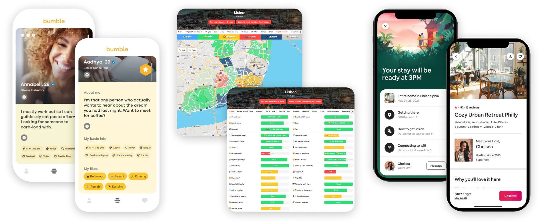
Day 2, Design Sprint: PostUp can learn from experiences within different industries. This includes working remotely, utilising space for alternative purposes or reading through friendly, specific profiles. For this reason, apps or websites addressing such topics were explored for inspiration. During user interviews, these were also mentioned as analogous experiences, especially Airbnb.
Articulate
Day 2, Design Sprint: The most critical screen is reviewing a potential location. This is because if it’s already filtered by a certain distance radius, users can make decisions promptly on the information provided. Getting to the critical screen with the location’s information should be quick.
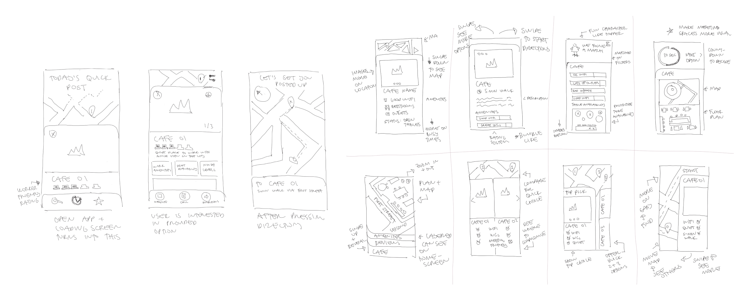
Information out there is time-consuming to dig through, with a lot of jumping back-and-forth between sites.
Chelsea, Freelance Graphic Designer
Apply
Day 3, Design Sprint: Instead of creating user flows, key microinteractions were considered through a storyboard format. This allowed for quick ideation, while thinking through critical moments. What became apparent was the importance of clear, illustrative information through graphs, icons or maps/plans.
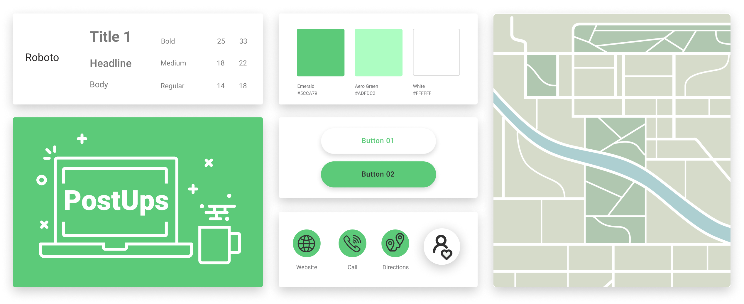
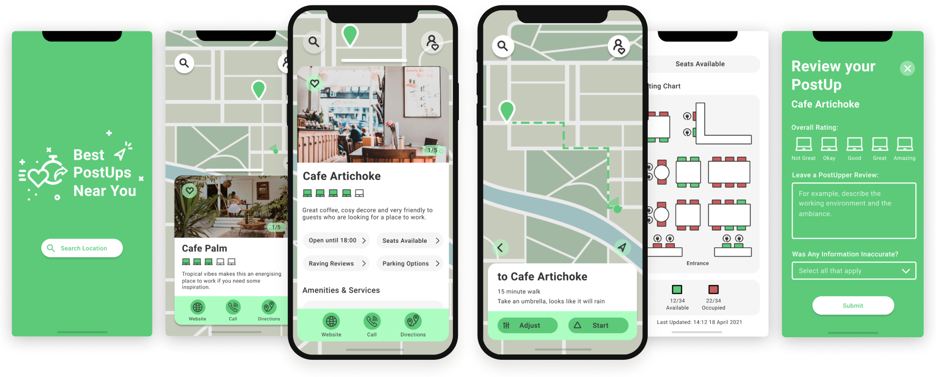
Day 4, Design Sprint: Expanded the existing brand colour and graphics to create a friendly, straightforward and ‘fresh start’ visual language. The palette is energising and calming, helping users when they make prompt decisions. Iconography plays an important role in making information immediate, especially amenities and services.
Assess
Day 5, Design Sprint: Five users tested the app, where four out of the five worked from cafes, while one did not. The latter provided insightful context into why, and how this app might encourage her to reconsider. Minimising distraction and creating a boundary between work and home were influential factors in deciding on and selecting a place to work out-of-home.
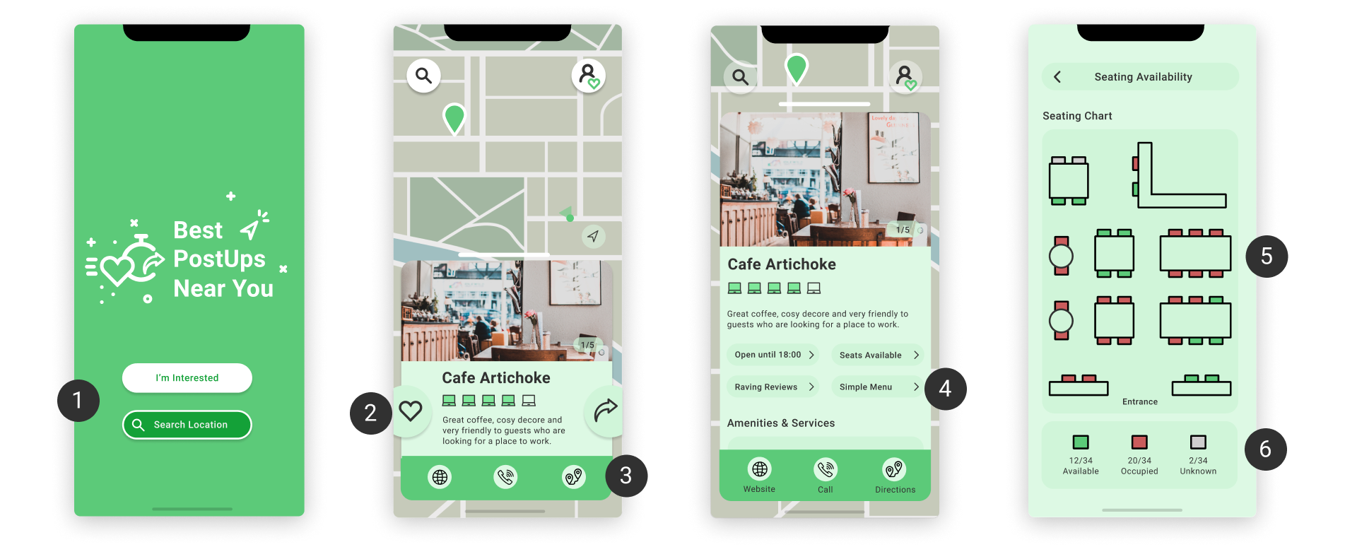
1. Dual Prompt
The prompt ‘I’m Interested’ for PostUps near you was chosen half of the time, where ‘Search’ was the other option.
2. Next Navigation
Next arrow cause confusion, and a number of users though it was to get directions.
3. Icon Clarity
Main navigation icons were not immediately recognised by users, especially the web icon.
4. Parking Information
Users wanted information about parking, including what type, possible duration and whether it was paid.
5. Seating Amenities
Provide more context around seating amenities, including outlet placement.
6. Seating Availability
Seating availability feature was valued but partially unclear, as users did not understand ‘unknown’.
The Result
Through the Google Ventures sprint process, an MVP was created for finding remote work locations. The intuitive experience and information structure enables users to find a location quickly, even between meetings. A fresh, uplifting and clean look & feel makes the app and its options feel friendly. This is important as remote workers want to feel welcome.
Go ahead, try it out for yourself
The Debrief
and Learnings
With only one key flow addressed, the next steps include building out the next flows for another round of testing. It would also need to go through a round of stakeholder approvals considering the quick process. As this app would be used on-the-go, it would help to understand if it is easy-to-use in context.
Faster Process, Solid Results
A design sprint is a short development time. However, the outcome still tested well compared to more involved design projects.
Small Details Comes off as Caring
Travelling to another location includes dealing with weather. Providing weather advice came off as caring to users.
Design Reflects Relevance
Like any design discipline, there are trends that date a user interface. Ensure current trends or best practices are used.